[PT-BR]
O Porto Amalfi é um empreendimento residencial desenvolvido para refletir a essência do viver mediterrâneo. Inspirado na arquitetura, no clima e na atmosfera da Costa Amalfitana, o projeto incorpora elementos que traduzem elegância, leveza e uma sensação permanente de bem-estar. Nosso desafio foi construir uma identidade visual que fosse além do óbvio: uma marca que conversasse com a estética italiana sem perder sua autenticidade local, conectando o público ao estilo de vida tranquilo, ensolarado e inspirador que Porto Belo oferece. A identidade criada pela Agência Amoon equilibra sutileza, movimento e modernidade, resultando em um visual que reforça a forte conexão entre mar, arquitetura e lifestyle.
[EN-US]
Porto Amalfi is a residential development created to reflect the essence of Mediterranean living. Inspired by the architecture, climate, and atmosphere of the Amalfi Coast, the project incorporates elements that express elegance, lightness, and a constant sense of well-being. Our challenge was to build a visual identity that went beyond the expected: a brand that embraces Italian aesthetics without losing its local authenticity, connecting the audience to the calm, sunny, and inspiring lifestyle that Porto Belo offers. The identity created by Agência Amoon balances subtlety, movement, and modernity, resulting in a visual language that reinforces the strong connection between the sea, architecture, and lifestyle.
Branding
Porto Belo - SC
Adobe Illustrator
Adobe Photoshop
Adobe Indesign
10 - Novembro - 2025
Porto Amalfi
🇧🇷 Português | Porto Amalfi | Porto Belo - SC
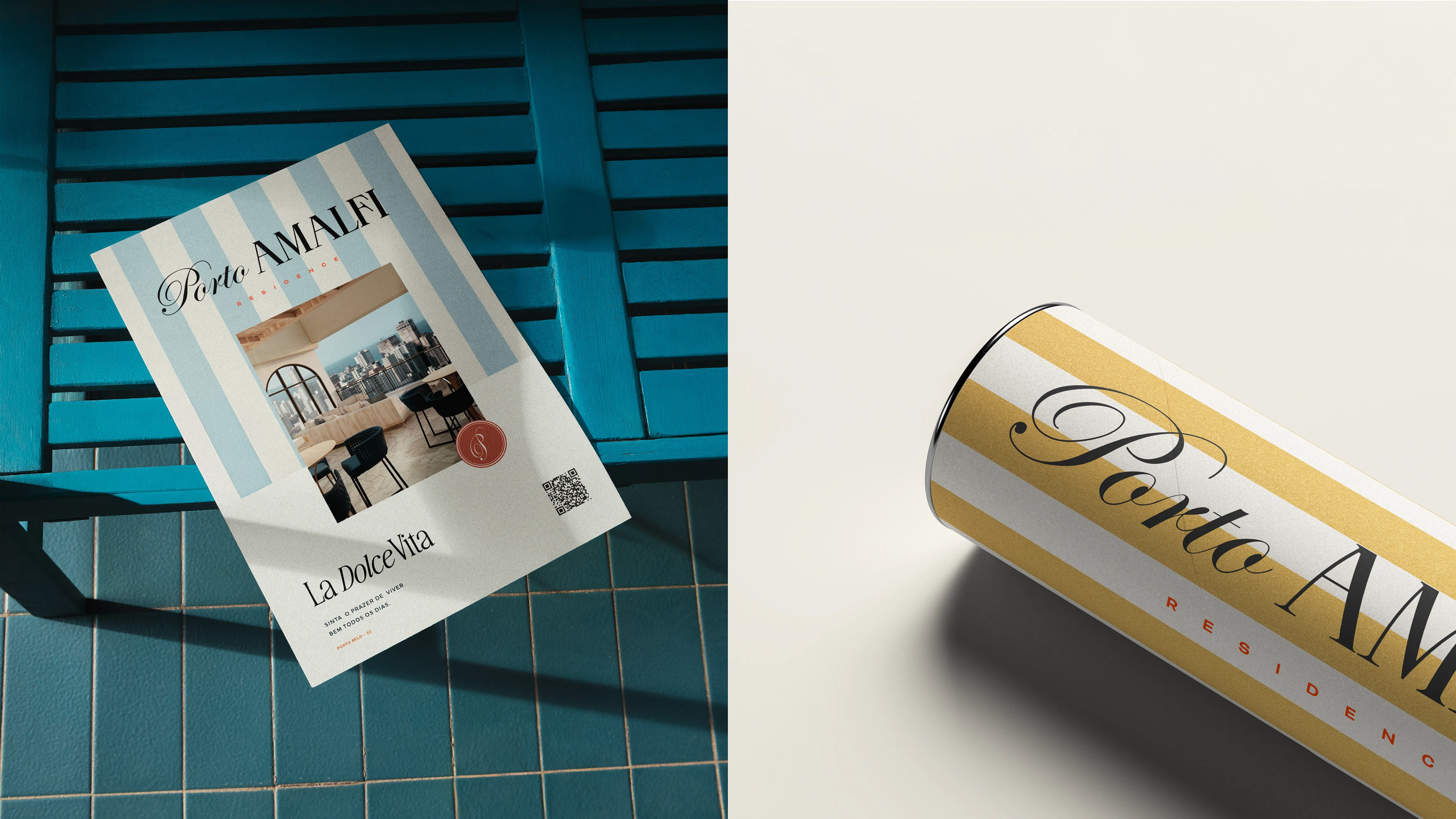
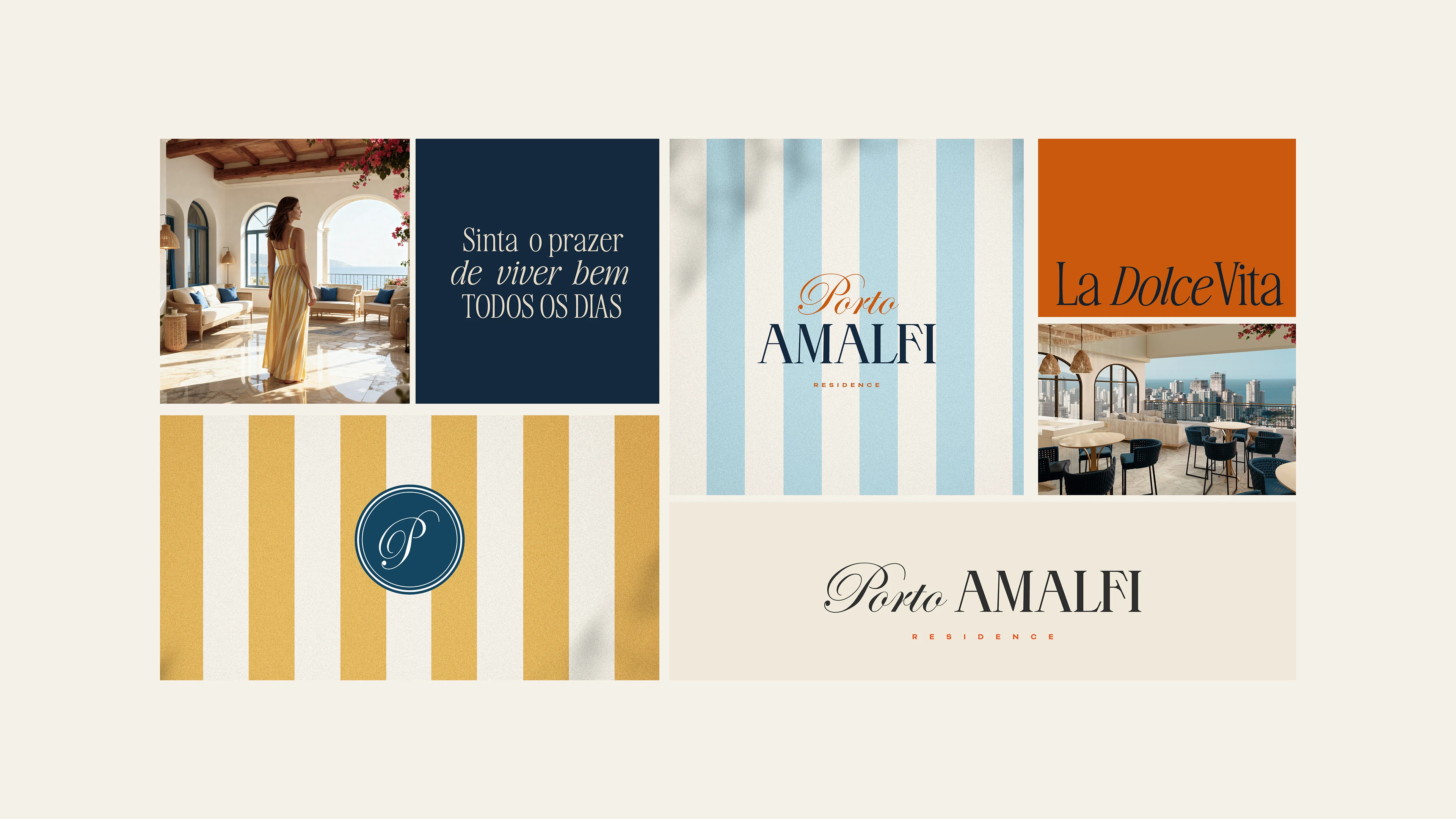
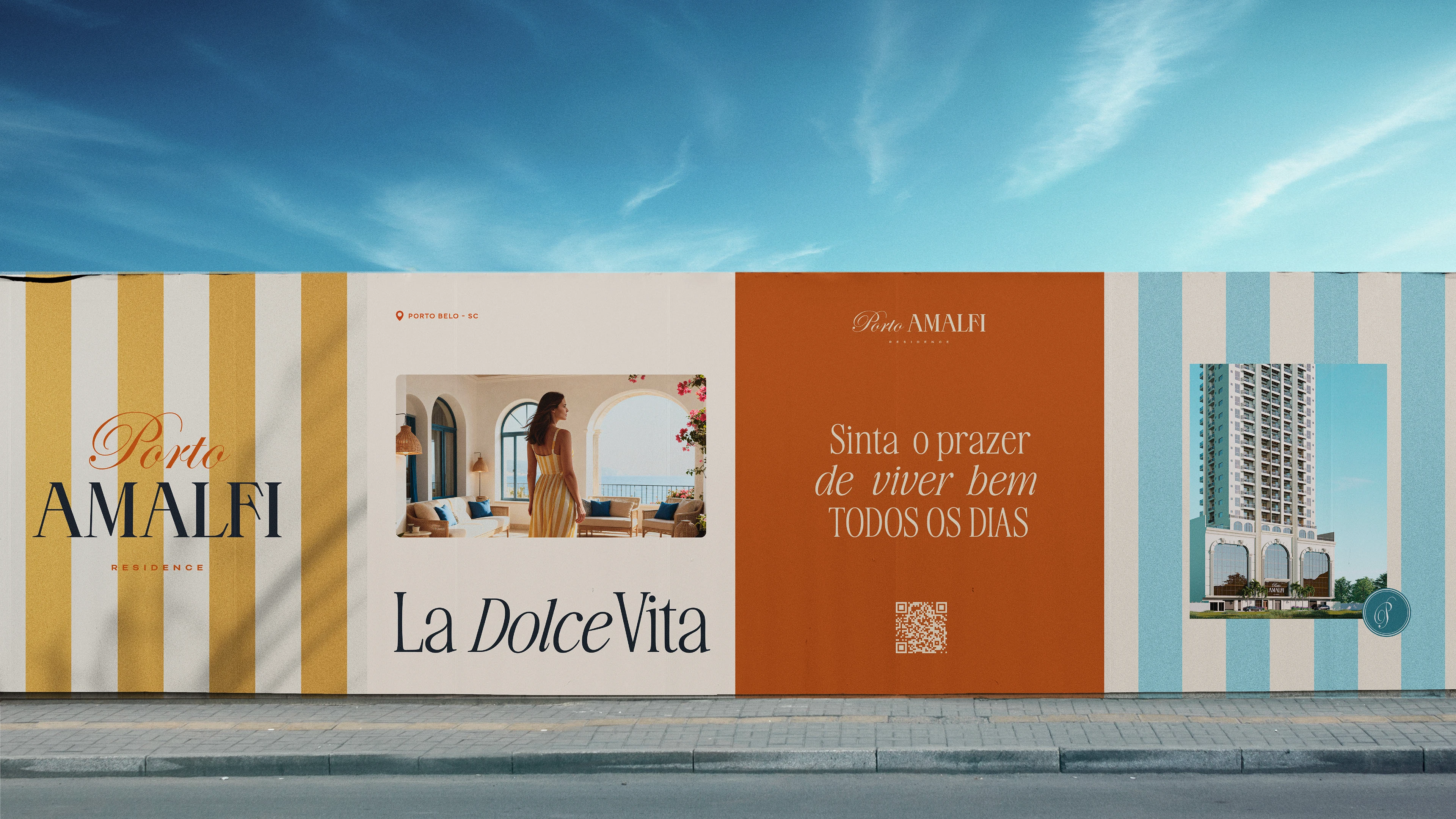
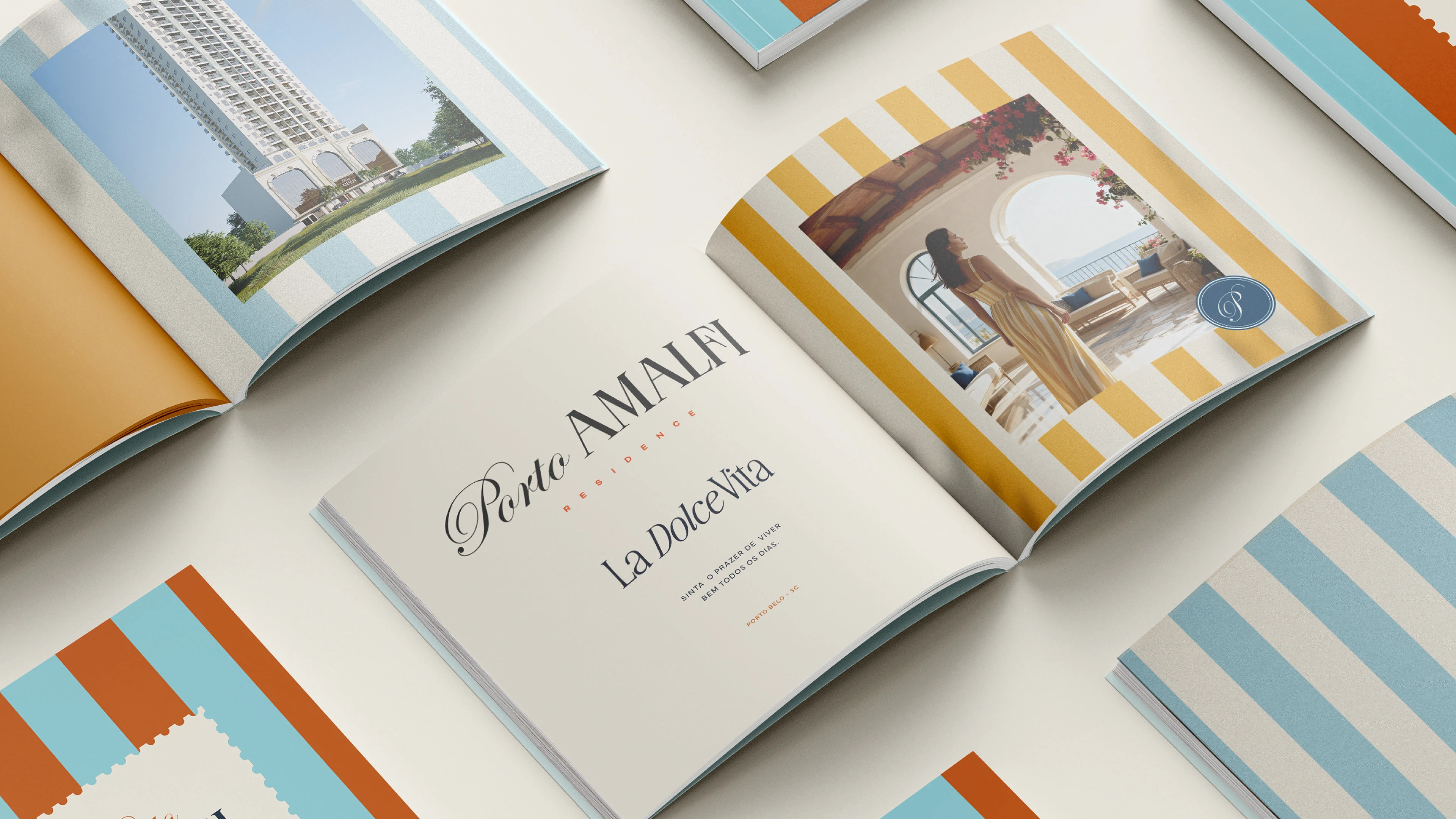
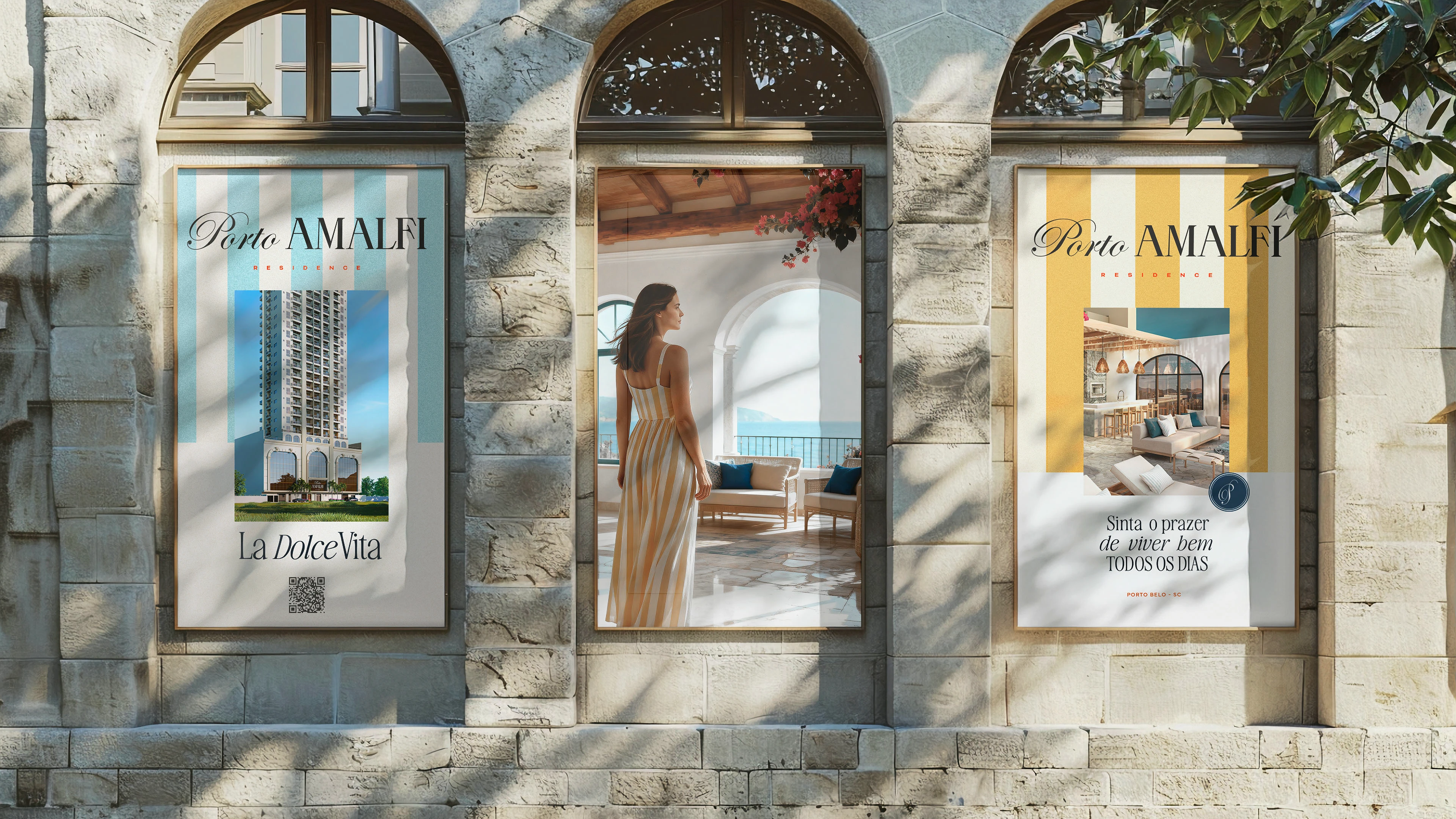
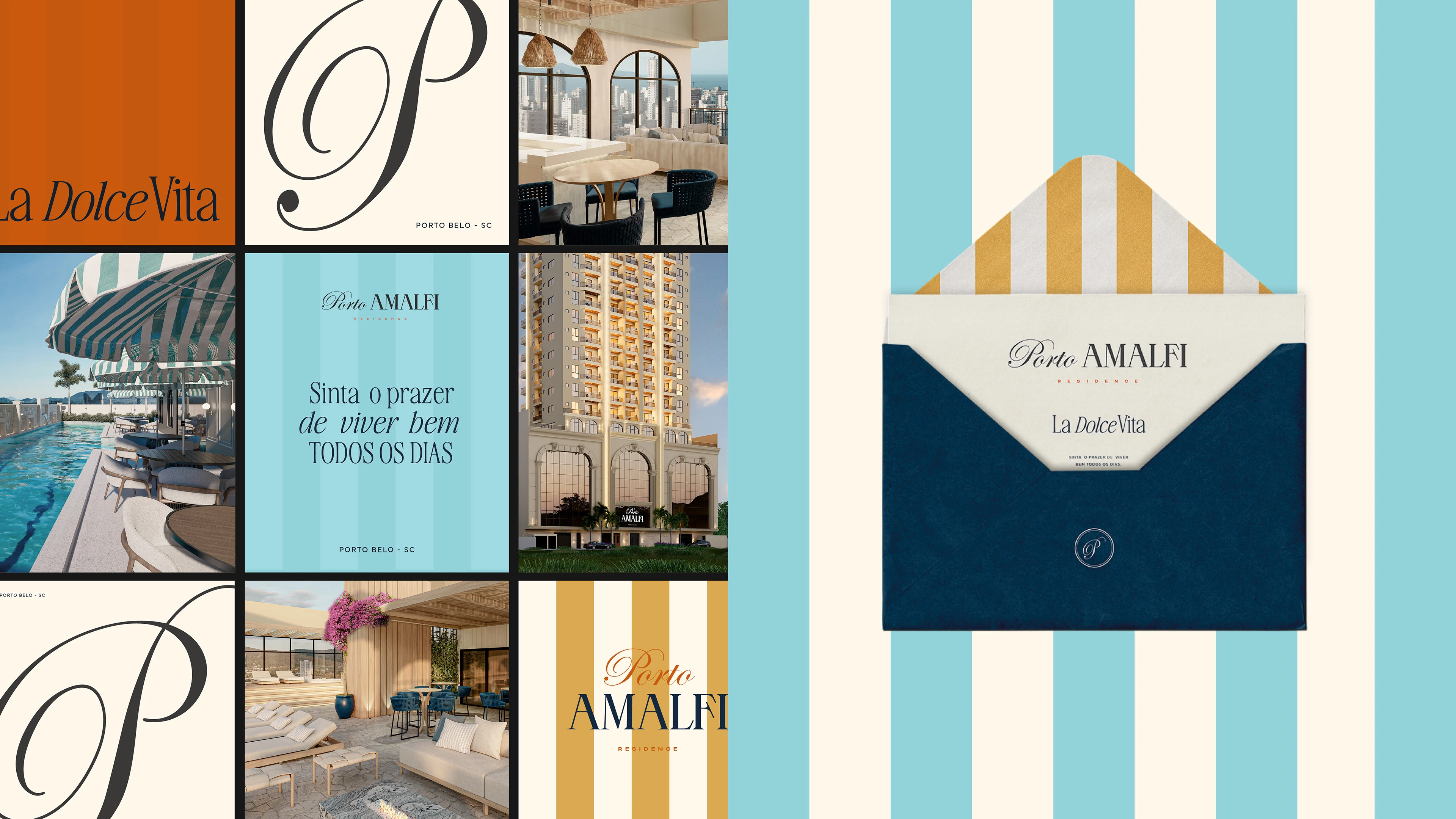
O Porto Amalfi nasce do desejo de transformar cada dia em uma celebração da beleza, da leveza e do propósito. O conceito criativo mergulha profundamente na filosofia italiana da “La Dolce Vita”, onde o tempo desacelera e a vida é vivida com intenção, elegância e simplicidade. Essa essência orienta toda a narrativa do projeto: um lugar onde a sofisticação encontra a autenticidade, onde cada detalhe importa e onde a arquitetura abraça naturalmente o mar.
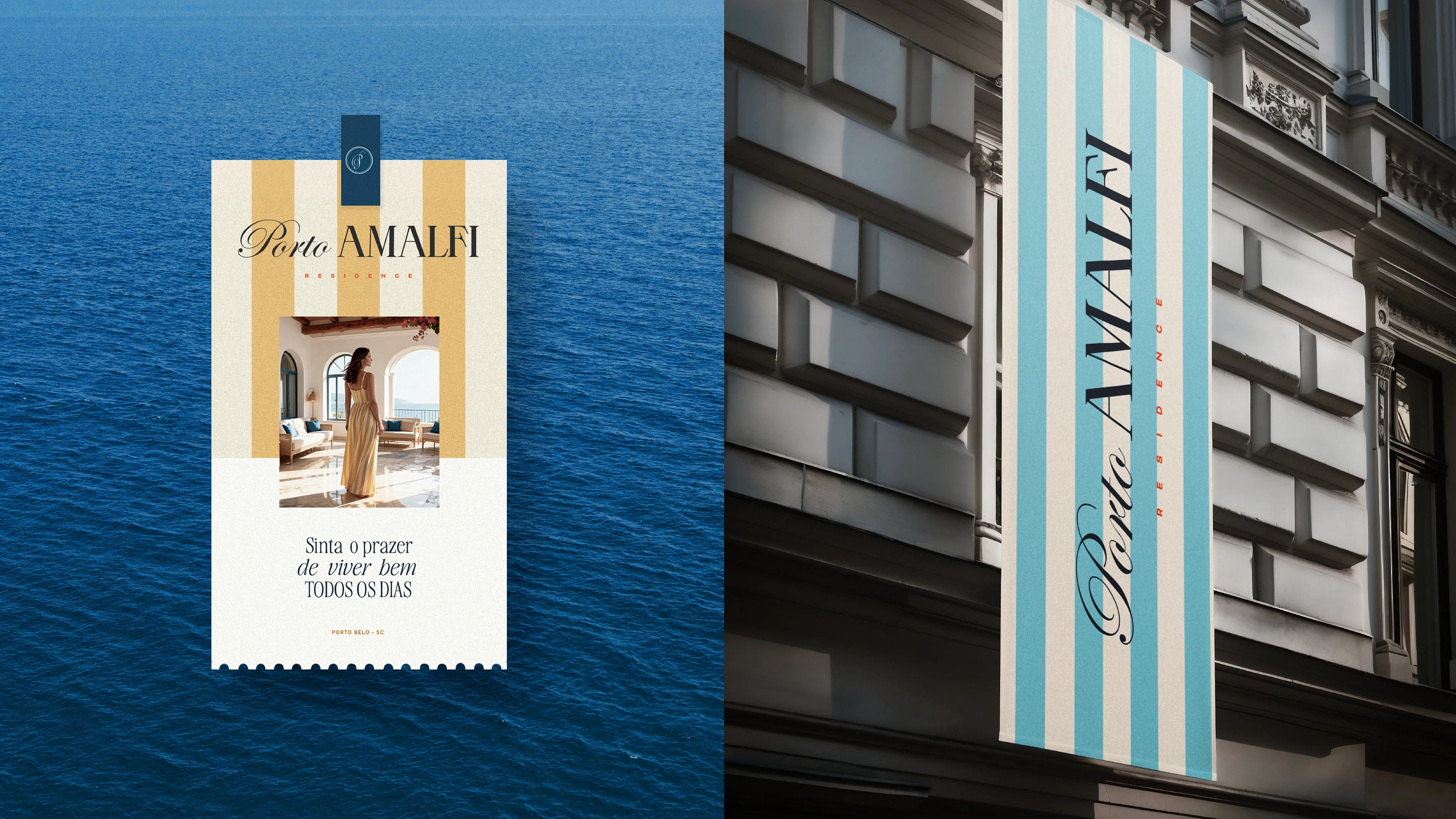
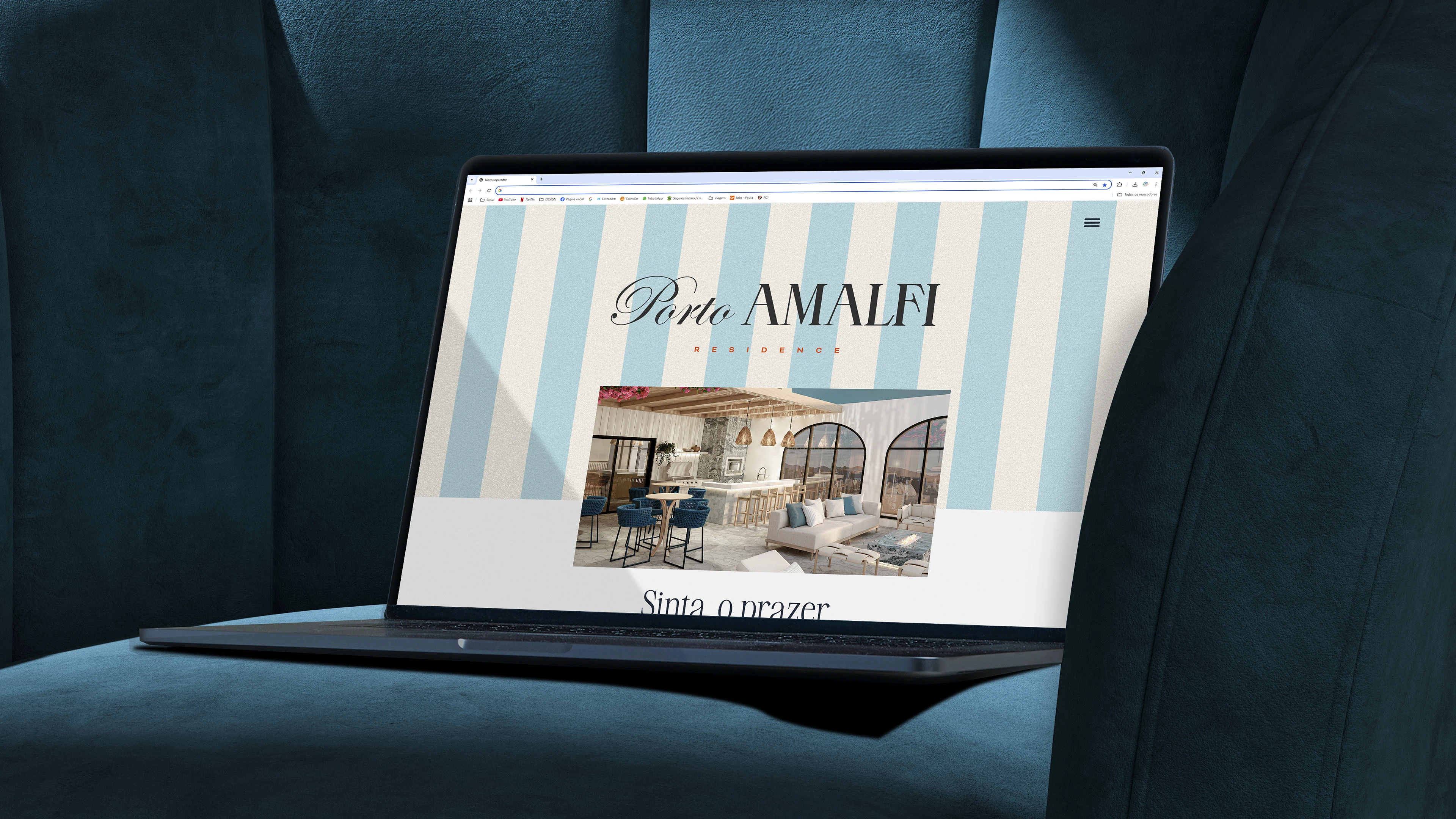
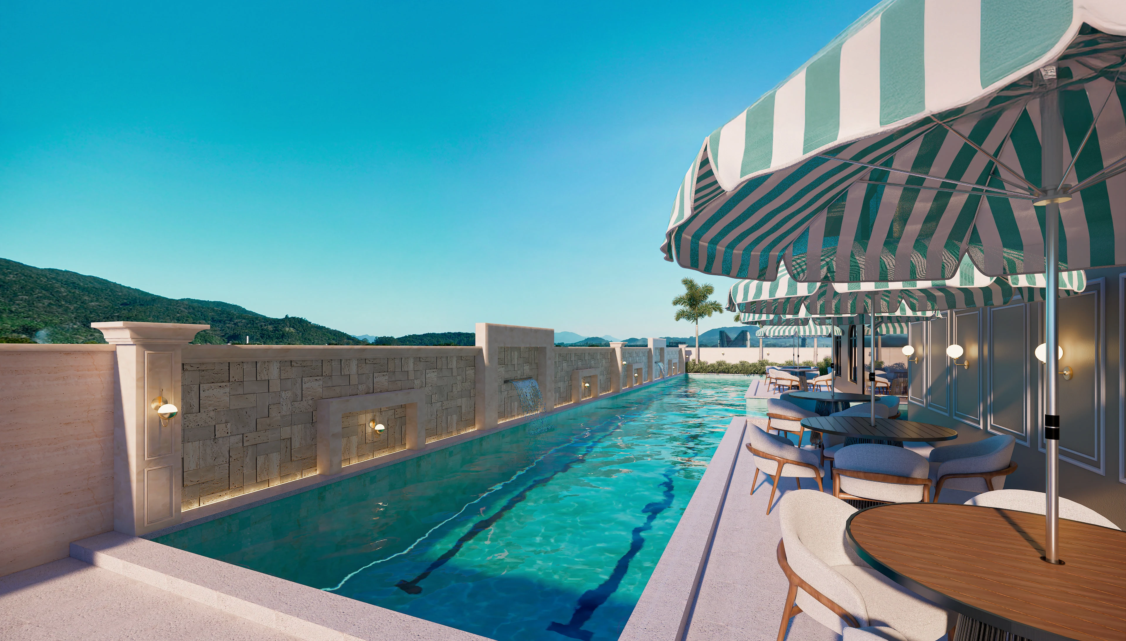
A identidade visual traduz esse espírito mediterrâneo em uma atmosfera acolhedora e contemporânea. Ela evoca a luz natural, as texturas suaves, as formas fluidas e uma paleta inspirada nas paisagens costeiras. O empreendimento foi pensado para oferecer espaços elegantes moldados pela luz do dia, vistas deslumbrantes que se abrem para o horizonte e ambientes tranquilos que convidam ao descanso e à contemplação. O Porto Amalfi representa um estilo de vida que combina conforto, beleza atemporal e uma conexão verdadeira com a natureza.
A Amoon traduziu esse universo em um sistema visual que equilibra modernidade e referências clássicas, criando uma marca que é ao mesmo tempo refinada e despretensiosa. O resultado é uma identidade capaz de capturar o valor emocional do viver mediterrâneo, sem perder a autenticidade do litoral de Porto Belo.
🇺🇸 English | Porto Amalfi – Real Estate Project in Porto Belo, Brazil
Porto Amalfi was born from the desire to transform each day into a celebration of beauty, lightness, and purpose. The creative concept draws deeply from the Italian philosophy of “La Dolce Vita,” where time slows down and life is experienced with intentionality, elegance, and simplicity. This essence guides the entire narrative of the project: a place where sophistication meets authenticity, where every detail has meaning, and where architecture naturally embraces the sea.
The visual identity expresses this Mediterranean spirit through a warm and contemporary atmosphere. It evokes natural light, gentle textures, fluid shapes, and a palette inspired by coastal landscapes. The project was designed to offer elegant spaces shaped by sunlight, breathtaking views that open toward the horizon, and peaceful environments that invite rest and contemplation. Porto Amalfi represents a lifestyle that combines comfort, timeless beauty, and genuine connection with nature.
Amoon translated this universe into a visual system that balances modernity and classic references, creating a brand that feels both refined and effortless. The result is an identity capable of capturing the emotional value of Mediterranean living while remaining true to the coastal character of Porto Belo.
🇧🇷 Português | Porto Amalfi – Empreendimento Imobiliário em Porto Belo, Brasil
O Porto Amalfi nasce do desejo de transformar cada dia em uma celebração da beleza, da leveza e do propósito. O conceito criativo mergulha profundamente na filosofia italiana da “La Dolce Vita”, onde o tempo desacelera e a vida é vivida com intenção, elegância e simplicidade. Essa essência orienta toda a narrativa do projeto: um lugar onde a sofisticação encontra a autenticidade, onde cada detalhe importa e onde a arquitetura abraça naturalmente o mar.
A identidade visual traduz esse espírito mediterrâneo em uma atmosfera acolhedora e contemporânea. Ela evoca a luz natural, as texturas suaves, as formas fluidas e uma paleta inspirada nas paisagens costeiras. O empreendimento foi pensado para oferecer espaços elegantes moldados pela luz do dia, vistas deslumbrantes que se abrem para o horizonte e ambientes tranquilos que convidam ao descanso e à contemplação. O Porto Amalfi representa um estilo de vida que combina conforto, beleza atemporal e uma conexão verdadeira com a natureza.
A Amoon traduziu esse universo em um sistema visual que equilibra modernidade e referências clássicas, criando uma marca que é ao mesmo tempo refinada e despretensiosa. O resultado é uma identidade capaz de capturar o valor emocional do viver mediterrâneo, sem perder a autenticidade do litoral de Porto Belo.
🇺🇸 English | Porto Amalfi – Real Estate Project in Porto Belo, Brazil
Real Estate Project in Porto Belo, Brazil
Porto Amalfi was born from the desire to transform each day into a celebration of beauty, lightness, and purpose. The creative concept draws deeply from the Italian philosophy of “La Dolce Vita,” where time slows down and life is experienced with intentionality, elegance, and simplicity. This essence guides the entire narrative of the project: a place where sophistication meets authenticity, where every detail has meaning, and where architecture naturally embraces the sea.
The visual identity expresses this Mediterranean spirit through a warm and contemporary atmosphere. It evokes natural light, gentle textures, fluid shapes, and a palette inspired by coastal landscapes. The project was designed to offer elegant spaces shaped by sunlight, breathtaking views that open toward the horizon, and peaceful environments that invite rest and contemplation. Porto Amalfi represents a lifestyle that combines comfort, timeless beauty, and genuine connection with nature.
Amoon translated this universe into a visual system that balances modernity and classic references, creating a brand that feels both refined and effortless. The result is an identity capable of capturing the emotional value of Mediterranean living while remaining true to the coastal character of Porto Belo.
🇧🇷 Português | Sobre o Logotipo
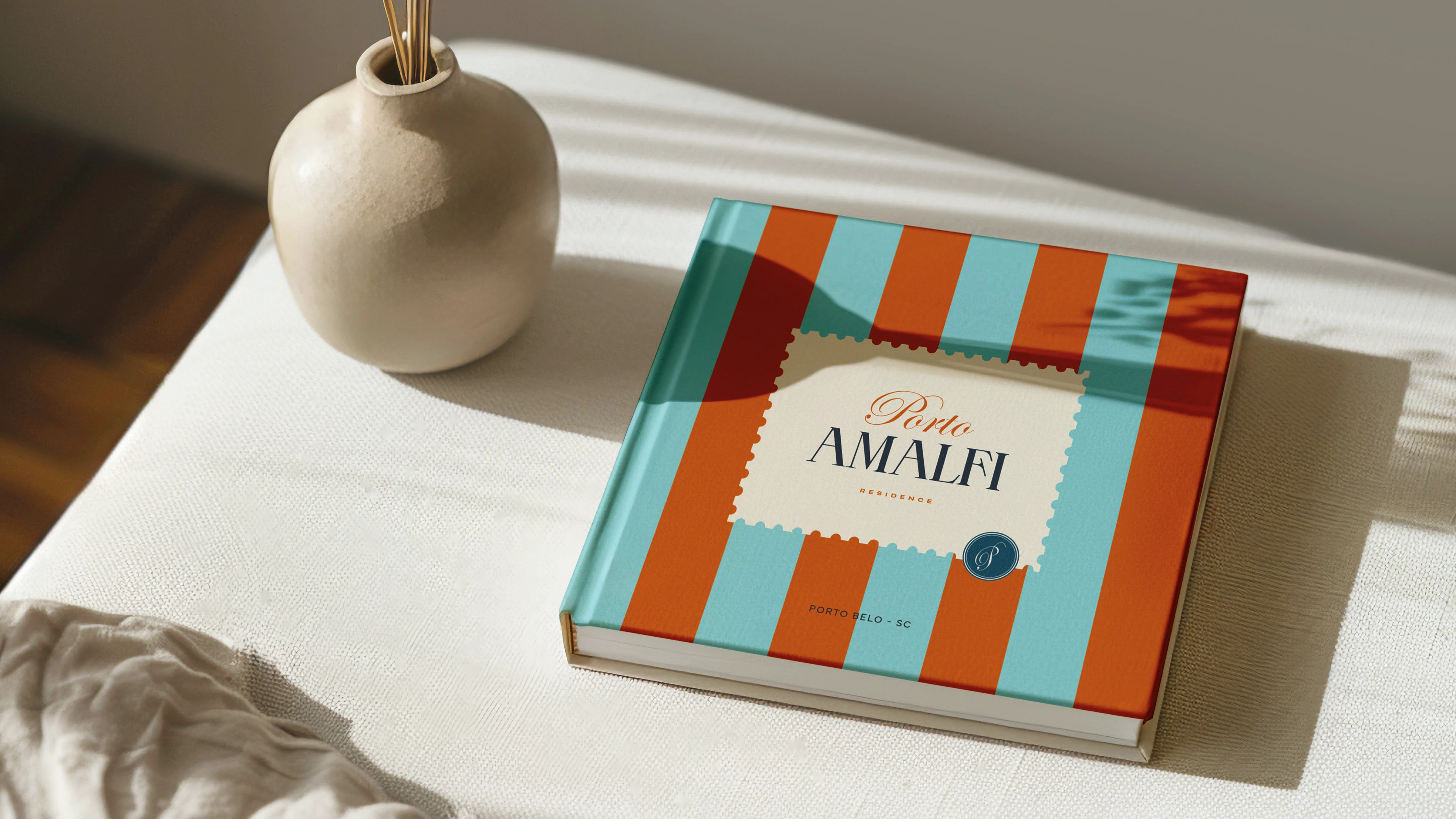
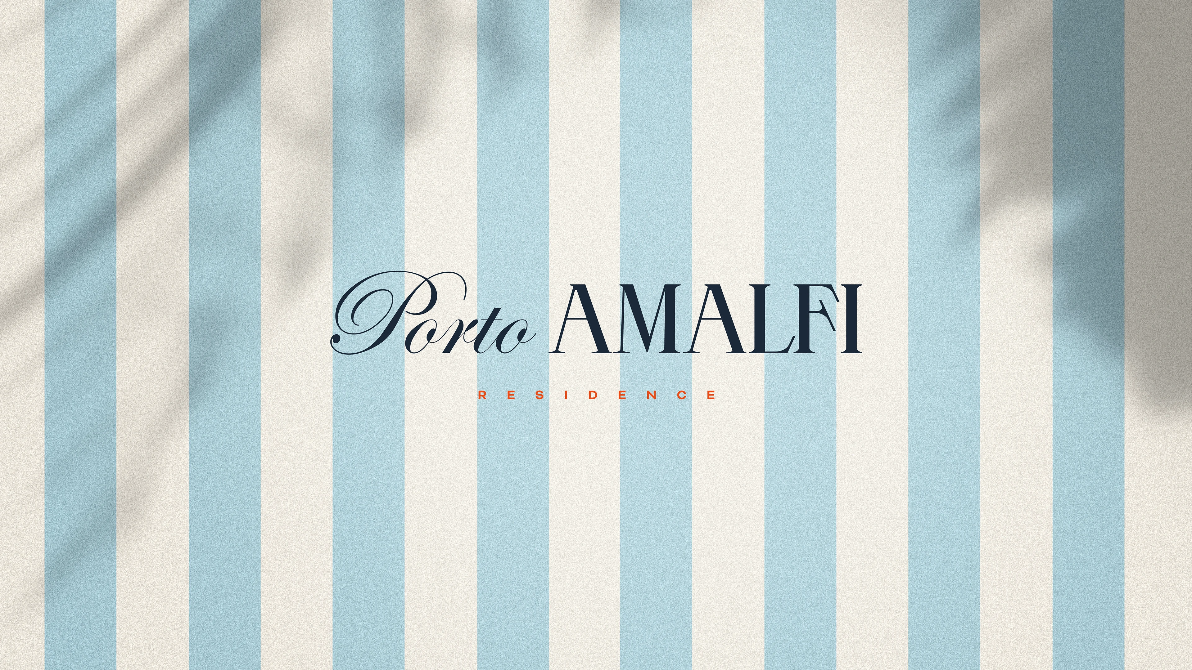
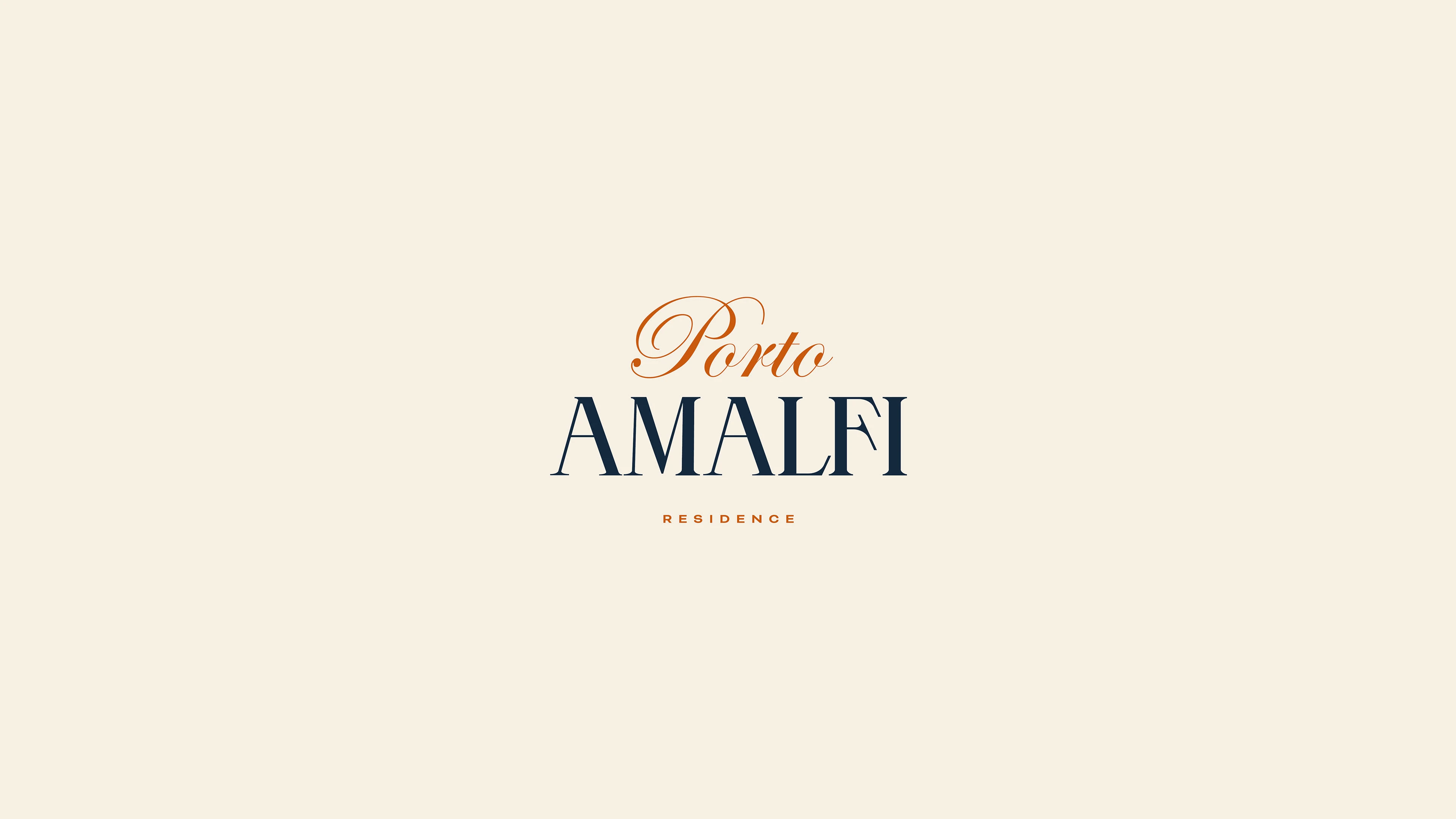
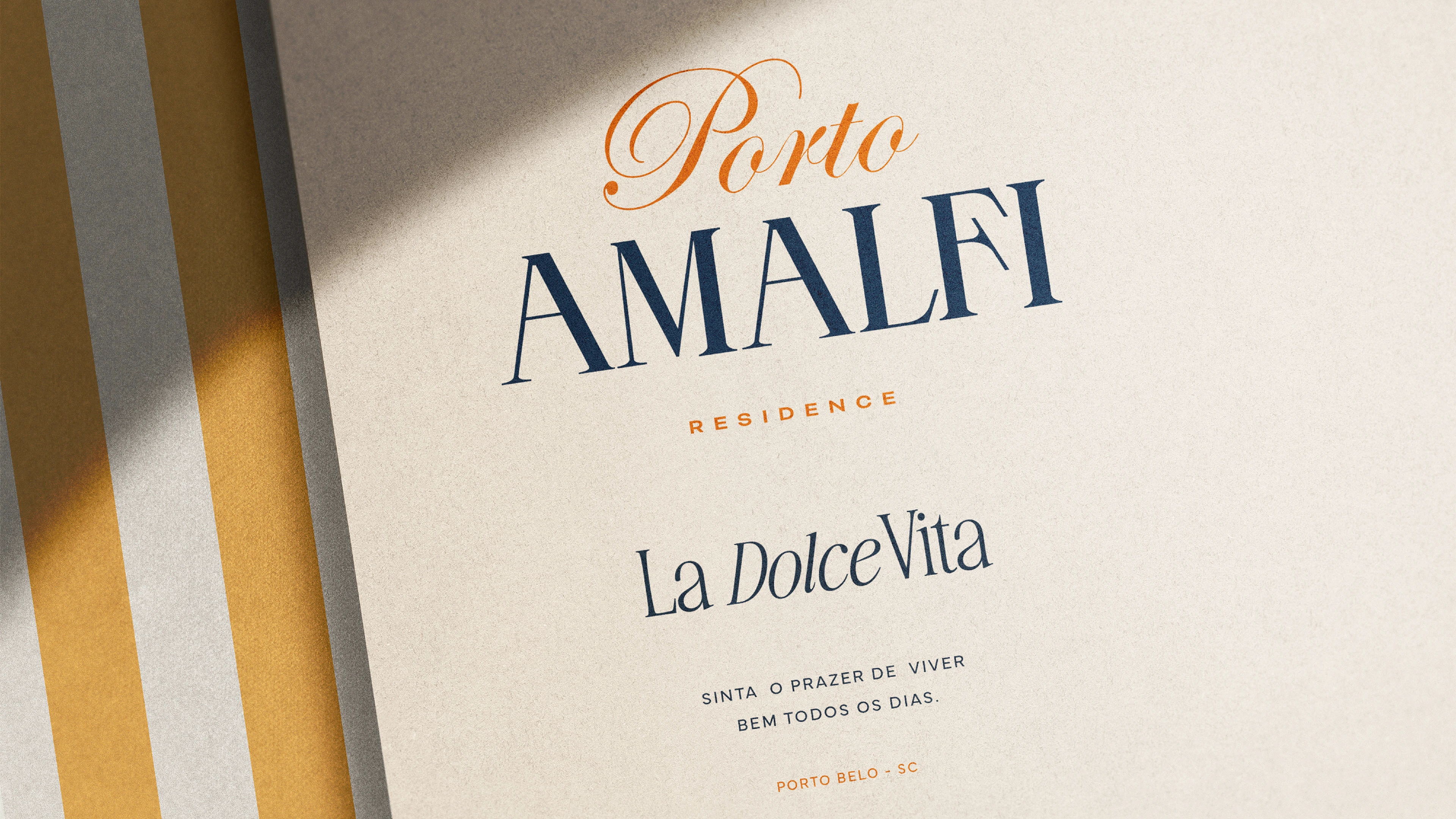
O logotipo do Porto Amalfi foi desenvolvido a partir da combinação entre tradição e contemporaneidade, refletindo o encontro entre a sofisticação italiana e a atmosfera leve do litoral catarinense. A composição tipográfica traz proporções elegantes, com serifas bem definidas e curvas sutis que evocam a estética clássica das cidades mediterrâneas.
A assinatura “Porto” em traço cursivo adiciona fluidez e movimento, como uma pincelada suave inspirada nas caligrafias artesanais italianas. Já “Amalfi”, com linhas mais firmes e presença visual marcante, traduz solidez, confiança e atemporalidade — atributos essenciais para um empreendimento que une estilo e qualidade de vida.
O resultado é um símbolo que se torna imediatamente reconhecível: delicado sem ser frágil, sofisticado sem ser excessivo, moderno sem perder a autenticidade do seu conceito.
🇺🇸 English | About the Logo
The Porto Amalfi logo was designed by blending tradition and modernity, reflecting the meeting point between Italian sophistication and the light, coastal atmosphere of southern Brazil. Its typographic composition brings refined proportions, well-defined serifs and subtle curves reminiscent of the classic elegance found in Mediterranean architecture and signage.
The cursive “Porto” introduces fluidity and movement, inspired by handcrafted Italian calligraphy and the effortless charm of coastal living. In contrast, “Amalfi” is built on stronger, more structured lines, conveying solidity, confidence and timelessness — essential qualities for a development that merges lifestyle and refinement.
The result is a signature that feels immediately iconic: delicate without being fragile, sophisticated without excess, and modern while remaining faithful to the heart of its concept.
🇧🇷 Português | Sobre a Tipografia
A tipografia escolhida para o Porto Amalfi desempenha um papel fundamental na construção de sua personalidade visual. Inspirada em referências editoriais e clássicas, ela une elegância e presença, criando uma leitura envolvente que remete ao design europeu. As serifas longas e bem marcadas reforçam a sensação de tradição e prestígio, enquanto o espaçamento generoso confere respiro, leveza e sofisticação. O diálogo entre fontes serifadas e cursivas cria contrastes que enriquecem o universo da marca: o clássico e o contemporâneo, o formal e o espontâneo, o sofisticado e o acolhedor. Essa combinação reforça o posicionamento do empreendimento como um espaço onde o viver bem é valorizado em cada detalhe — desde a arquitetura até a comunicação visual.
🇺🇸 English | About the Typography
The typography selected for Porto Amalfi plays a central role in shaping its visual personality. Inspired by classical editorial design, it blends elegance and structure, creating a reading experience that evokes European refinement. Its long, pronounced serifs emphasize a sense of tradition and prestige, while the generous spacing brings breathing room, softness and sophistication to the composition. The interplay between serif and cursive typefaces introduces a rich contrast: classical versus contemporary, refined versus effortless, structured versus welcoming. Together, these elements reinforce the project’s positioning as a place where living well is reflected in every detail — from architecture to visual identity.